Pages

Thursday, September 26, 2013

Painting the Kitchen Cabinets: Part 2

Do you ever have those weeks, where your day job says to you "Yea, this is all you'll be doing this entire week, including evenings"? That's me this week, it's my turn.  I haven't had a spare moment aside from working, eating & sleeping - crazy! But I found time to sneak in a post, since I felt so guilty being postless all week.... Last week I posted Part 1 of Painting the kitchen cabinets, and this week I'm so excited to show the rest:
Aaaaah! Fresh & Clean.... this time we used the sprayer, which is pretty self explanatory, maybe I'll do a post on it someday though.  But as you know, we DID do the white ones by hand, or roller... (full directions in Part 1).  Also - we decided to add a few coats of minwax polycrylic on this set, in semi gloss.  Being the bottom half, they'll be more likely to get beat up so.. better safe than chipped, right?

Before I show the close-ups, the color is Glidden's Blue-Grey Slate.  Paint & Primer in one (a must!), in Interior Semi-Gloss. Here is a link to the color.  Always tell your paint person what you need the paint for, as they will have the best advice for your finish.

Like I said, I'm sneaking in this post before work, so let's get to the good stuff:
It's an interesting color! I love it - sometimes it has a blue tint, other times  a dark grey... and at sunset it gives off a blue purple.  Hooray... color changing cabinets!
Things are starting to come together. Yes, those are rainbow knives! Ha I know.. typical of me, right?  Many of you asked about them - they are called Pure Komachi, and they're the best knives I've ever used, so sharp.... (find them here on amazon - they have tons more too).  Rather than use a knife block, we used IKEA magnetic knife strips to keep the counterspace pretty free.
This area is to the right of that stove, across an entryway.  I love that blue-grey slate!
Hello new rug! (Ikea.... lovely!)
Oops! Bad photographer moment... Surprise appearance by Sir Brown Paper Bag, who in our part of the country, is becoming a rarity...
Oh, I grouted that round marble lamp in the top corner there, I'll be sharing that soon - came out great.
There we go! I love this angle.. really shows off that stove.  What do you think of our newish cabinets? Eventually the counter-tops will be hopefully butcher block, but cement would be amazing too.  We'll see how the wallet feels when the time comes.  All in all, painting the cabinets was the affordable upgrade we needed, to hold us over until we redesign the kitchen all together.  But honestly? They came out so good I wouldn't mind them sticking around...

What about you, any cabinet transformations in your future?

Back to work... wish me luck...   ;)

Have a fantastic weekend!
     -Jesse

Related Posts in-case you missed it:

And one last time, here's the paint color link, Glidden's Blue Grey Slate:
Linkies: FacebookPinterestInstagramTwitterSubscribe & of course, Email me.

Wednesday, September 18, 2013

Painting Kitchen Cabinets: Part 1

Well we did it! We painted our kitchen cabinets, finally. They weren't horrible to begin with luckily, just not what we were going for.  Our kitchen has a lot of wood going on, and while I love it - I love bright and light a bit more.  Before & After reveal, of the top half:
What a difference, right?! Let me just say, this is something you can definitely do.  It's pretty easy, just time consuming! I made a major boo-boo in when we did this top half.  Ha... let me explain.  We did the top by hand, using high density foam rollers - the works, ya know? It came out great BUT on the LAST coat I realized...  I HAVE A HVLP Sprayer!!! Why in the world didn't we spray them??  Oh well... at least now I can verify that it CAN be done by hand, if you don't have a sprayer.  Stop me, I'm rambling- Here's a better shot of our cabinets before.
Pretty standard, nice cabinets.   I was just happy to have this many cabinets in the first place, though you can never have enough. So one brave weekend, we took to the job. I referenced East Coast Creative's awesome tutorials, which you can find here and here.  It looked relatively simple...Here's a quick run down:

First we removed the cabinets & hardware:
With all that food & junk we definitely won't be going with the open shelves look... haha...

Quick tip: To remove these cabinets you take the screws out of the hinge portion on the cabinet door. This also leaves the settings on those crazy hinges intact, and makes them a lot easier to re-install. Here's a crappy photo that sort of shows what I mean:
The hinges remain.... see? But ya know, do what you like, it's probably fine either way.

Side note, many of you asked about our stove from the Entryway Command Center Posts... here's a full frontal:
Isn't it perdy.. in pretty good shape too. When we first moved in we considered getting rid of it, but a combination of everyone saying we were insane & then falling in love with cooking on it, it's decided to stay. Someone said it was from the 1940's, but I forgot where I heard that. I might have made it up.

Ok, cabinets! After the hardware was removed, we did a simple steel wool job to remove the glossy finish. We'll be using Paint & Primer in one (best stuff ever) so I'm confident in how it will adhere. Even still, steel wool is an extra step that will really bump up your cabinets durability rating.
Just run over the fronts to scratch them up a bit, I'm using the coarse - paint removing steel wool. In person you can see scratches in the glossy finish, and that's how you know you're good to go.  Be sure to get the sides and in those grooves too, as best you can.

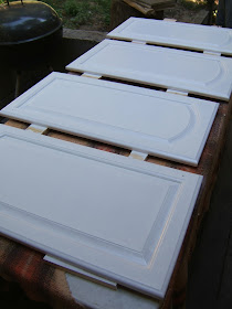
Then start painting! We started by doing the details by hand, notice we propped the cabinets up on some old wood scraps so they didn't stick to that gorgeous blanket:
And finished up with a high density foam roller. These foam rollers are different than your average paint roller, as they leave a very-very smooth finish that looks clean & professional.  The rollers are smaller, about 6" wide, to see it on HomeDepot.com, click here.
Yum....The paint color we used is just white. Semi-gloss white, Paint & primer in one.  There were SO MANY whites to choose from so I walked up to the counter and said "Don't  you have just...ya know... white?" And they did. And now we do.

After about 3 coats we were happy, and let them dry completely.  Working backwards we just installed our hardware, and popped the cabinets back up. Just in time for dinner. 

Surprise! I have a gif for you..

Ha! Get it? A Gif?!? Ok, bad joke...

So that's it! We're done with the top half. The Paint & Primer in one paint, in semi gloss, adhered wonderfully to the cabinets & provide an excellent finish.  If you want to be extra safe, you could slap a few coats of semi-gloss minwax polycrylic on these babies.  I had every intention to do so, but got hungry and forgot.  I would have gone back and done it by hand, but in my dreams there are new cabinets with glass fronts anyway... so who cares.

Let's see some finished photos that aren't as difficult to look at as that crazy gif:


Don't mind that wild white cord, the lighting in here was just ONE of those little boob lights, so we had to improvise. I'll get to it someday, I swear....
Hey did you guys notice that weird yellow animal on top of our cabinets? I have NO IDEA what it is! But it was yellow & cute in it's own weird way, and $3... so it came home:
A blow-fish? A pig? An artichoke?  I just craved a little yellow up there, and I couldn't stop staring at this thing.  Hey, good conversation starter...

So that's that. Cabinets done in white, and I love 'em. What do you think? Have you painted cabinets? What tips & tricks can you share?  Up next we are conquering the bottom half... and there are twice as many. Break out that sprayer!

Enjoy your day please. (One time at the end of a phone call, the person said to me "You have a nice long day, Jess"....what the!?)

-Jesse

Monday, September 16, 2013

7 Kitchen Buffet Ideas

For some weird reason, I've become obsessed with getting rid of our Kitchen Hutch.  I don't know what happened, I love that hutch! But something about it, cute as it is, just isn't me (You can catch up here, if you're new)  I've started leaning more towards the modern / vintage / geometric look, and our old country beauty just couldn't fit. But I'm always up for a challenge, and I do like change - so maybe it was perfect timing.  This time however, I'd like to go more towards a Buffet vs. a Hutch...
That's right, it's time for a good old fashioned brainstorm - with the help of the lovely Pinterest.  You know why I'm leaning to a buffet? I like the height.  They are low... can be minimal, a streamlined surface offering plenty of storage & serving space, without needing to be a giant presence in the room.

So today, I want to share with you my Pinterest findings - Seven lovely buffets that are giving me all sorts of ideas..... here we go!

As a reminder, with all my round-ups, the source links are underneath each photo, mmk? First we'll start with my dream buffet...
Source
Yea... look at that wood! And geometric paneling? Yes please! This would be perfect. If I can find it, I'll snag it - but in the meantime, it's great inspiration.  Around here furniture like this doesn't last - people are on top of it.
Source
So the photo above isn't exactly a buffet, but this is what I'm going for. Wonderful, abundant storage in the space underneath the counter - with cute floating storage on the walls.  Don't you love those cubes? I'm seriously reconsidering my plans and swapping to cube-age...
Source
Aside from the Christmas-ey motif, this buffet has a lot going on! Major wine storage (huge plus) with ample cabinets and drawers. Again, the floating shelves are ideal for displaying your kitchen favorites that don't deserve the hidden cupboard life.
Source
I probably wouldn't put the green/pink combo in my own home (too muppet-y), it IS cuper cute. I WILL however take that buffet! Seriously, have you ever been to a thrift store? Buffets & Dressers that can be EASILY converted to buffets are a dime a dozen.  A coat of white paint and maybe an architectural alteration here and there.... you're in buffet heaven.
Source
OK - favorite alert! The buffet above is what I'd love to aim for. I like the simplicity of the piece, and the floating shelves are exactly what I have in mind.  Storage on the walls that also serves as decorative. Now we're onto something!  You can see in photo #2 that they added wine glass holders... so smart!
Source
Pumpkins ahoy! Did you notice that? Must have been around this time of year when they shot this photo.. What I love here is the all black.  This seems like it was a dresser in a former life, but by going solid black (like the chairs & table) with hardware to match, you have a gorgeous matching buffet. Hello red lampshade!
Source
Yea - the caption in the photo proves this isn't a buffet per say.. but man, couldn't it be? I'm totally considering ditching the subtle color thing and going to a fun teal. I know I always do that, but I cant' help it! I'm considering painting all of the bottom cabinets in our kitchen a subtle color... so maybe we can afford a little teal here & there.  Or is that more turquoise?

These are only seven of the thousands of possibilities. What I really like here is how these looks were achieved by using easily attainable furniture, or better yet - furniture you already have.  A coat of paint, or the addition of some wall shelves, makes a buffet storage solution that doesn't have to be built in.

What's your opinion, are you pro-hutch or are you a buffet believer?

Wish me luck on my hunt....I know something perfect is out there, I can FEEL it..

-Jesse

Full Kitchen Ideas Pin-Board HERE.

Linkies: FacebookPinterestInstagramTwitterSubscribe & of course, Email me.

Friday, September 13, 2013

Entryway Command Center Part 3: Rope Trimmed Accent Wall

Details, details! The "command center" has come along nicely - it's been a really smooth project so far, but something's missing. More gold? Nah.. Ralph had an idea, and pitched it to me with the expectations that I'd think it was nuts. He said, "what if we lined where the walls meet the crown molding with some sort of rope?" -----and I was silent.
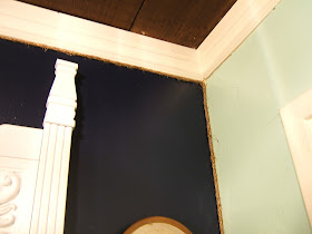
Genius! I loved the idea.  Have you ever heard or thought of putting a trim on the walls? I'm hooked.  See - we have these weird walls (I'm sure they aren't that weird, everyone has 'em.) The texturing is so... textured... that it makes it really hard to make a clean line in the corners. Even with tape. So covering with a cute rope is perfect! All you need is rope, and a glue gun.

Hold on real quick - did you  notice I swapped the plant out? In the Entryway Command Center: Part 2 post I used a bundle of grasses as our plant.  Well,  remember how I had a redwood cutting living on my desk for over a month? It's still going strong (month 2!), so I figured, why not put another one here:
I'm so impressed with how long these stay fresh - I change the water regularly and they stay bright green. Even in low light!
We have so many popping up around here that I'll never run out.  Problem solved!

Back to the project - we went rope shopping, and found this 1/4" Manila Rope at Home Depot.  You can also find it on Amazon if you aren't up for the trek to HD - I know it can be a lot! (I've seriously just given up and put things back before, when I can't find what I need, or someone to cut this or that...ha! I'm so impatient sometimes)


So, pretty simple here, just start hot glue-ing your rope into the corners.  This worked really well with two people, I quickly ran the glue while Ralph pushed the rope in.
If you've worked with hot glue before, you know this low temperature stuff peels off easily. So if you mess up, just peel it off, or if you no longer want rope on the corners... just peel it all off.
Isn't that cute? It's subtle, but adds just a little detail to our wall.  Plus it goes great with the white, navy blue, gold thang....

Here's the cow!

Got a little flyaway on that one, no stress... rubs right off..
We chose this particular rope because of it's darker color, and it has a lot of rough edges.  It's also just thick enough to hide any less-than-perfect paint lines.
I found this little plaque downstairs that I bought years ago at a goodwill. Didn't have a home in our new house yet, so I tried it out. I think it works:


Well I think we are done!  Part of me wanted to put a wall filing system in the corner, near the mirror, but I think with that many drawers we can afford to keep this very clean & clutter free.

To recap, we went from this:
To a whole new, fully functional & adorable "command center":
Ignore the rope there, we were mid project. You know how it goes! Have a fantastic weekend everybody, if you decide to tackle an area in your home, send it my way - I love to see what you're up to! 

Up Next: 7 Kitchen Buffet Ideas... I'm about to swap ours out.

-Jesse
OMG - did you notice it's Friday the 13th? Creepy...

Linkies: FacebookPinterestInstagramTwitterSubscribe & of course, Email me.

Wednesday, September 11, 2013

Entryway Command Center: Part 2 - Card Catalog Makeover

Hey there! Last time we chatted, I showed you how we are embarking on the remodel of our Entryway Command Center, starting with the navy blue paint.  I introduced my card catalog in it's before state (yellow, black, and cream....) and now I'm ready to reveal it's new look:
Mmmm! Smell that? Fresh spray paint.... one of my favorite smells, despite the fact that those fumes are probably not healthy. Ha! A more responsible person would have let it breathe for a few days - but I don't have that kind of patience, sadly. (don't be like me!)

As a refresher, here's the card catalog (and the wall for that matter) in it's original state:
Doesn't match as much as I'd like it to, in my mind I was seeing Blues, whites & golds.. kind of like this color block stool tutorial I did a while ago. Exactly like that actually. So I went to Home Depot & started paint shopping.  Since this piece is metal, getting the paint to adhere is a breeze - like I said, this will be color combo #4 for this lil baby.

If you have a card catalog you want to paint, follow along - it's the easiest makeover ever.  Actually, going down memory lane here - this very piece is the FIRST makeover I ever did. (Really REALLY old post here, on a long expired blog)

Can you believe how many drawers there are? Yep - they all had to come out, and it was FULL of junk I didn't need.  Spring Fall cleaning time!
Thirty. Thirty drawers.  Which, the way drawers work, this meant thirty junk drawers.  Most people only have 1 or 2. We have thirty.

I laid out our ginormous drop cloth, my thirty drawers, and got to cleaning. I stuck with a vinegar water combo, makes me feel like I'm being "green" n stuff.
 Here are my weapons of choice:
That gold one makes me happy... it's so shiny! There was a time when I would never have put as much gold into my home as I am now.... and that time is over. Bring it!

First some primer.  I know it says paint + primer, but I'm still skeptical and figured I should take the extra 15 minutes for some added protection. After all, this is going to get a lot of use.
Fun part - the colors! I did these at random. There is no pattern, it's just easier that way & comes out great.
Oh remember I said I was looking for a mirror to put there?  I was hoping for something simple, with a white frame.. when I realized - duh - spray paint the one I have leftover from our bedroom dresser project!
That pup is plastic (why?!), so good thing this spray paint adheres to plastic.  Be sure to double check that if you need to paint on plastic.  If your brand of spray paint doesn't, you can buy a plastic primer.  Use that first, then your regular paint after just the same.

Look who else is getting on the gold train:
Bunny! This piggy bank sits by our door and collects our change.  Last time he was full it was $70! Beforehand he was a certain nameless companies promo bun-bun.  He reminds me of those chocolate bunnies at Christmas... I tried to wrap a red ribbon around his neck but it made him look super chubby, and I had to be honest with him about that.  Those ears just weren't helping.

This coat hook was dark brown before, and practically disappeared against the navy blue. So gold it is!
I thought, am I getting carried away with all this gold? Then when I hung the cow up I realized what a silly statement that was... he's so cuuuute:
Gold & Navy Blue.  The perfect couple.

Now that my painting is done (was simple, right?) It's time to put it all back.  Here's the plain jane wall:
First our card catalog with random drawer placement:
To the right is just a spare shoe rack we had. In the future, a box-tray will be built to make it level with the card catalog & appear to be one piece. For now, it's fine.

Bring in the mirror:
How about a shot with a little natural light, eh?
Ah! Fresh & clean, plus it kind of looks like it's all one piece. When we step back into the kitchen, you can see a lot of the navy has been covered up... making it even more of just an accent:
Back a little farther (hey thanks for the nice comments on our stove! We love it too!):
I think we're making some progress here! Bun-Bun in his new home.....
"Feed da bunny..."
Then I shopped around the house for a few accent pieces to fill the dead zones (for now.... or forever.. we'll see):
I wanted some height in that corner, so a vase with a cluster of yellow grasses from the back hill did the job. Too bad they can't last...

There you go! We have tons of storage, the top 5-6 drawers serve as organizers for wallets, mail, keys.. while the rest serve as a more organized junk drawer/filing system for important junk.  A place for everything & everything in it's place, that's normal right? Haha... there's only one thing I think is a little crazy, the bottom 9 drawers are for storing color coordinated paper....  I have a problem!

What do you think of the entryway command center? It's moving right along, with a just a few details left:


  • Paint the command center wall Navy Blue
  • Paint the card catalog white...
  • Find & Paint a mirror
  • Bring in the accent colors & pieces  (gold? light blue?)
  • Trim the edges in something special. (Jute?)


  • Thanks for stopping in - hopefully I've convinced you to scout out a card catalog of your own.  Up Next  we'll focus on some details, adding rope trim to our accent wall.

    -Jesse

    Linkies: FacebookPinterestInstagramTwitterSubscribe & of course, Email me.